
1 / 4
description1
Description1 provides essential product details, structural configurations, and technical specifications tailored to optimize your overall project experience.
Yes, this design is built using a mobile-first responsive framework, ensuring perfect rendering and seamless interaction across smartphones, tablets, and desktops.
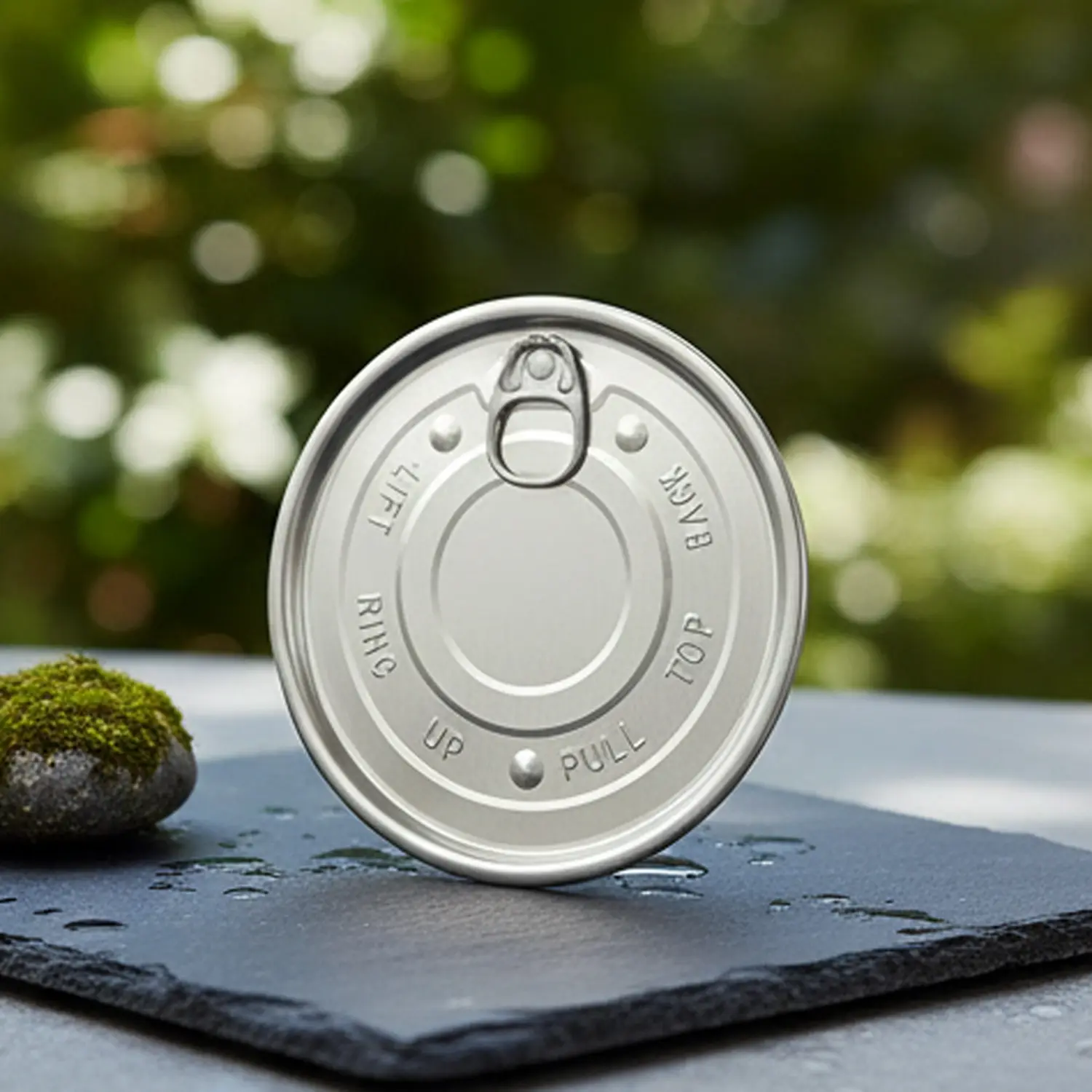
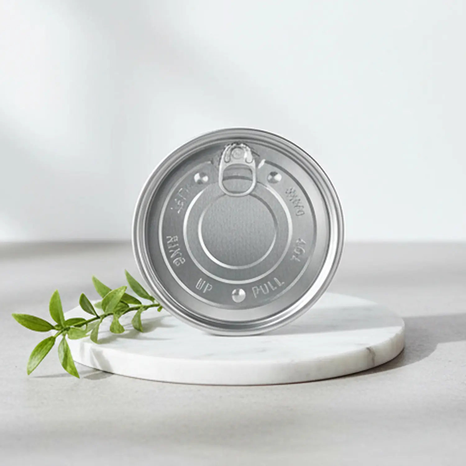
Images are arranged in an organized grid of 2 to 3 columns per row, restricted to a maximum width of 600px to maintain crisp clarity without distortion.
No, all class names are strictly scoped with a unique prefix to guarantee zero style pollution or conflict with your host template.
By implementing semantic HTML elements, optimized visual hierarchy, and lightweight code, search engine crawlers can index the page content more effectively.
Yes, the typography and spacing dynamically adjust using modern CSS standards to deliver optimal readability on any modern screen resolution.